Logos of many big brands “change as unchanged” and interesting stories behind
The “corner of the corner” 7 billion dong
The story of Xiaomi’s 7 billion VND “corner kick” for a long time has caused constant talk on social networks. Specifically, the new logo of this brand was commented as “looks no different from the old one”, “is it this easy to design but costs 7 billion?”…
However, experts, the design and creative community think it is a worthwhile logo. Because this is not simply a logo redesign, but also a research process to upgrade Xiaomi’s own internal spirit.
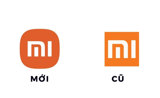
Undertaken by the famous Japanese designer Kenya Hara, Xiaomi’s new logo and identity undergoes a very meticulous research and design process, with the design concept being “Alive” – starting from “relationship”. relationship between technology and life”. The famous Japanese designer said: “We believe that technology is increasingly developing, becoming an indispensable part of our daily lives. The relationship between people and technology is therefore the same. are also increasingly connected and this is what inspired us to design the concept of “Alive”. A design philosophy that is completely in line with the philosophy of Xiaomi”.
In 2015, Facebook also went through a logo change that many people did not want to admit as a change.

When asked from an industry insider’s perspective, Jowey Roden, co-founder of Koto Studio, shared: “These changes, though small, are aimed at constantly improving the product in a world is in constant motion. Facebook hasn’t changed its essence and the logo improvements reflect that. They are still young, modern but more “serious, mature”.
What’s more, small changes don’t go alone. Facebook proved it with a series of 8 new features introduced in the same year.
VPBank and the subtle change, sending customers confidence in prosperity
In Vietnam recently, VPBank also surprised customers when there were subtle changes in the brand logo.
Established in 1993, VPBank re-branded for the first time in 2010, changing its name from Joint Stock Commercial Bank for Non-State Enterprises to Vietnam Prosperity Commercial Joint Stock Bank. This is also the first time the bank has launched a featured “flower of prosperity” with a striking red color.
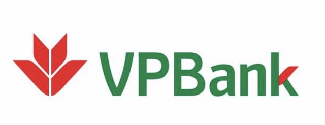
The logo has followed the development of VPBank over the past 10 years
In the next 10 years, VPBank has grown by leaps and bounds from a “micro” bank to the top 4 leading banks in Vietnam. Thinking that this bank was very satisfied with its position and brand, in April 2022, VPBank once again announced the re-branding.
The new brand of the bank has changes that are no different from the style of Xiaomi or Facebook, which means that you have to look closely to discover the upgraded details. Do the “big guys” always have their own way?
The “Flower of Prosperity” and the bank’s old logo cluster have been refined to the golden ratio with a new, more modern font. The sharp corners are “planed” round in harmony with the square lines. The old dark green is replaced by a fresh green, and a gradation from green to blue appears.

Exquisite new logo of the bank
“The subtle change of the brand identity represents the continuing development, inheriting and elevating what we have built. The change of identity also shows the dynamism, non-stop. transformation of VPBank’s brand” – VPBank representative said.
Obviously, a whole story, an ideology has been conveyed in even very small changes. The brand identity “changes as the same” as a clear statement that “we will have breakthrough new development strategies but still maintain the core values and foundations of the bank”. .
Along with the new identity image, VPBank’s brand statement was also changed from “Action for dreams” to “For a prosperous Vietnam”. The new statement is consistent with the name of Vietnam Prosperity Commercial Joint Stock Bank, which, according to Mr. Nguyen Duc Vinh, General Director of VPBank, affirmed, “It is VPBank’s promise to accompany and bring prosperity to each individual customer. individual, each enterprise, each partner, each shareholder, each employee and the whole country”.
It can be seen that, with new potential, new position and new brand, VPBank confidently sets for itself a higher and more sacred mission – serving the country. The Bank has even come up with a specific action strategy to fulfill this commitment with 4 components: Financial, physical, spiritual and community prosperity.
The first move is Light Up Vietnam – a music festival gathering top Vpop stars that will be held by VPBank on April 23 in Ho Chi Minh City. Besides cheering for the spirit and will of a resilient Vietnam after the pandemic, Light Up Vietnam is also expected to spread the value of “spiritual prosperity” that VPBank pursues to the community.
Following Economic Life
at Blogtuan.info – Source: cafebiz.vn – Read the original article here

