The living space is more beautiful thanks to the architect’s standard color scheme
In interior decoration and architecture, it can be said that color is the source that creates the soul for the overall space, deciding the success or failure of a whole project.
Architect Do Nguyen Anh Quy shared, in interior decoration and architecture, it can be said that color is the source that creates the soul for the overall space, deciding the success or failure of an entire project. submit.
As designers understand, color greatly affects the positive or negative mood of its owner.
The art of color mixing will convey the message that the architect sends into each of his designs. So what is the art of standard color schemes and what methods are there?
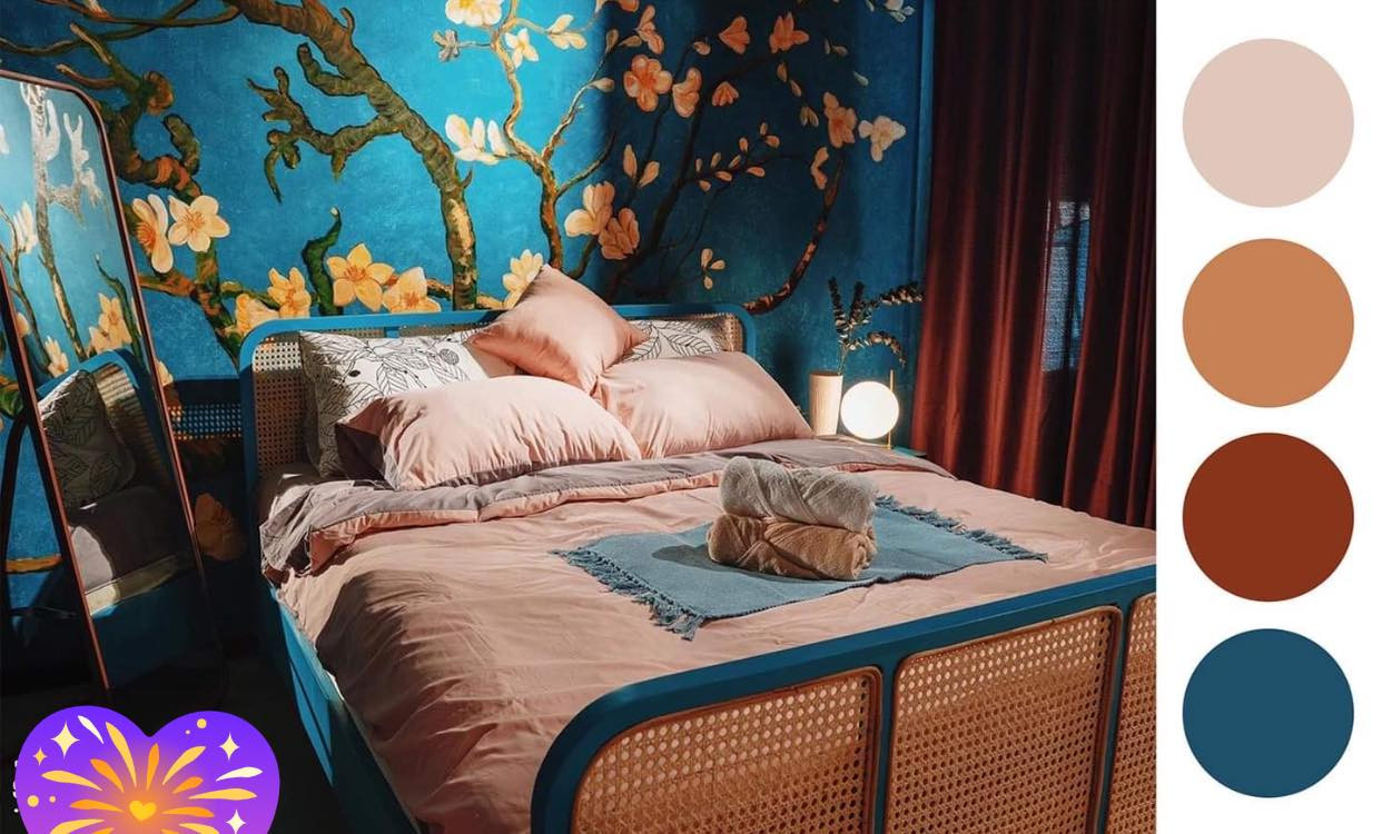
Here are some of Mr. Quy’s advice in project paint color coordination:
According to Mr. Quy, there are 12 colors on the standard palette, from this palette and through the color schemes will generate hundreds of thousands of different colors, the creation of colors is unlimited.
Monochromatic color scheme:
This is the simplest and easiest method to implement. You only need to choose 1 color from 12 colors on the standard palette. Then flexibly blend more black or white to create a lightness for this color. Using this method, your home space will be uniform with the same color and make people feel more comfortable. But the main disadvantage is that the space creates a safe look, without accents.
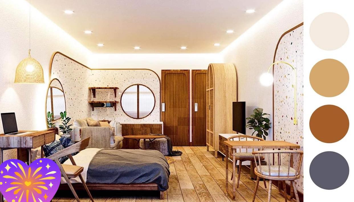 | 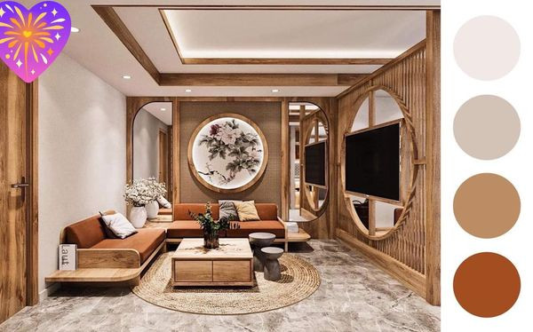 |
The monochromatic color scheme makes it more pleasing to the eye.
Color scheme according to the rule of 60-30-10
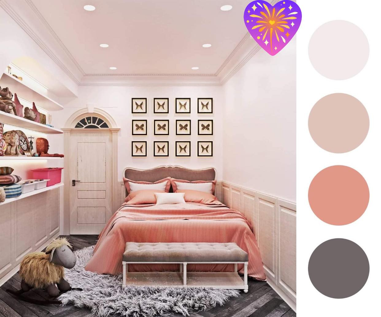
This is perhaps the oldest rule of color scheme in interior design, also considered the golden rule in this field with the following proportions:
Main color: 60%
The main color will be used for the walls, floor (or carpet, curtains) and for the main, large-sized pieces of furniture. All are not necessarily the same color, but the main color should always stand out the most.
Secondary color: 30%
These are the colors used for the rest of the furniture or the lights. This is also the color that creates depth and interest in the decor.
Highlight color: 10%
This is the color that helps you create something special for the space. Although this part of the color accounts for a small percentage and you can ignore it, if there is a little highlight to make the space more special, why not try it?
Contrast color scheme
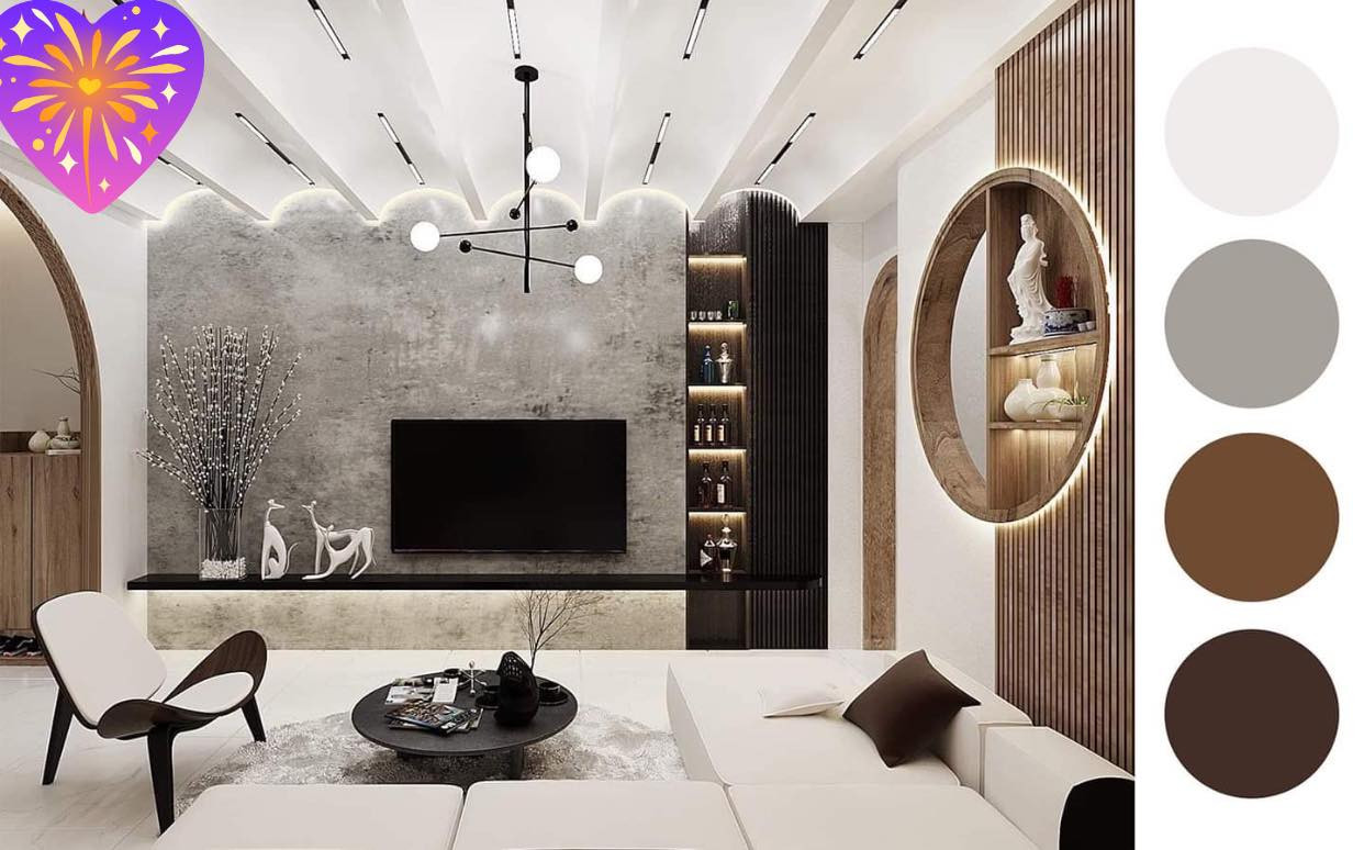
This is a way to use two colors that are symmetrical on the color palette, this color scheme will create a very good visual effect, making the space more vivid and impressive. But it will be noted that the ratio of these two colors is not uniform 50-50, but one color will dominate most of the space, the other color will be used to create accents.
Quynh Nga
at Blogtuan.info – Source: vietnamnet.vn – Read the original article here
